Very Peri, a vibrant blue-purple, is the Pantone Colour of the Year for 2022.
Not only has it been heralded as the 'It' colour for 2022, but Very Peri is in fact a brand new colour created by Pantone for the first time ever in the history of its Colour of the Year forecasts.
'We are living in transformative times,' say Pantone. 'Very Peri is a symbol of the global zeitgeist of the moment and the transition we are going through. As we emerge from an intense period of isolation, our notions and standards are changing, and our physical and digital lives have merged in new ways.'
Encouraging personal inventiveness and creativity, Pantone describe Very Peri as a 'dynamic periwinkle blue hue with a vivifying violet red undertone'. It blends the faithfulness and constancy of blue with the energy and excitement of red.
Inquisitive and intriguing with a carefree confidence, Very Peri is the happiest and warmest of all the blue hues, helping us to embrace new possibilities and opening us up to a new vision as we rewrite our lives in a post-Covid world.
In the home, Very Peri will inject a playful freshness into interiors, enlivening a space through unusual colour combinations. A guaranteed pop of colour even in the most pared-back living spaces, this versatile shade is suited to different materials, textures and finishes, whether introduced through a painted wall, furniture or home accessories.
'As we move into a world of unprecedented change, the selection of PANTONE 17-3938 Very Peri brings a novel perspective and vision of the trusted and beloved blue colour family,' says Leatrice Eiseman, Executive Director, Pantone Color Institute. 'Encompassing the qualities of the blues, yet at the same time possessing a violet-red undertone, PANTONE 17-3938 Very Peri displays a spritely, joyous attitude and dynamic presence that encourages courageous creativity and imaginative expression.'
For 23 years Pantone's Colour of the Year has influenced multiple industries including fashion, home furnishings, and industrial design, as well as product packaging and graphic design.
Every single Pantone Colour of the Year from 2000 – 2022

2022: Very Peri
Very Peri is a dynamic periwinkle blue hue with a vivifying violet red undertone. Futuristic in feeling and encouraging inventiveness and creativity, Very Peri blends the faithfulness and constancy of blue with the energy and excitement of red. A brand new shade, it's the first time Pantone has created a new colour in the history of its Colour of the Year forecasts.

2021: Illuminating and Ultimate Gray (JOINT)
For the second time, the blending of two shades – Illuminating and Ultimate Grey – are chosen as the Pantone Colour of the Year.
Illuminating is a bright and cheerful yellow sparkling with vivacity; a warming yellow shade imbued with solar power.

2021: Illuminating and Ultimate Gray (JOINT)
For the second time, the blending of two shades – Illuminating and Ultimate Grey – are chosen as the Pantone Colour of the Year.
Ultimate Grey quietly assures, encouraging feelings of composure, steadiness and resilience. The versatile grey shade resembles pebbles on the beach and natural elements whose weathered appearance highlights an ability to stand the test of time.

2020: Classic Blue
An expansive presence, Classic Blue is evocative of the vast and infinite evening sky opening a world of possibilities.

2019: Living Coral
Living Coral is an animating and life-affirming coral hue with a golden undertone that energises and enlivens with a softer edge.

2018: Ultra Violet
A dramatically provocative and thoughtful purple shade, Ultra Violet communicates originality, ingenuity, and visionary thinking that points us towards the future.

2017: Greenery
A refreshing and revitalising shade, Greenery is symbolic of new beginnings.

2016: Rose Quartz and Serenity [JOINT]
For the first time, the blending of two shades – Serenity and Rose Quartz – are chosen as the Pantone Colour of the Year.
Serenity is weightless and airy, like the expanse of the blue sky above us, bringing feelings of respite and relaxation even in turbulent times.

2016: Rose Quartz and Serenity [JOINT]
For the first time, the blending of two shades – Serenity and Rose Quartz – are chosen as the Pantone Colour of the Year.
Rose Quartz is a persuasive yet gentle tone that conveys compassion and a sense of composure.

2015: Marsala
A naturally robust and earthy wine red, Marsala enriches our minds, bodies and souls.

2014: Radiant Orchid
An enchanting harmony of fuchsia, purple and pink undertones, Radiant Orchid inspires confidence and emanates great joy, love and health.

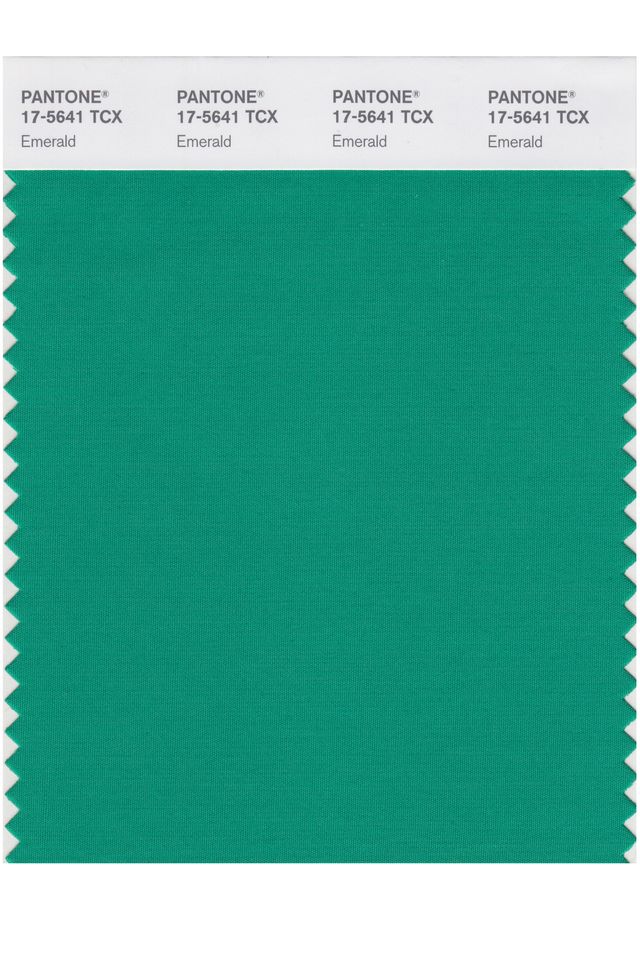
2013: Emerald
A luminous, magnificent hue, Emerald is the colour of beauty, new life and prosperity.

2012: Tangerine Tango
Reminiscent of the radiant shadings of a sunset, Tangerine Tango is a vivacious, magnetic hue that emanates heat and energy.

2011: Honeysuckle
A bright, sherberty pink shade, uplifting and optimistic, evoking nostalgic feelings of summertime.

2010: Turquoise
Combining the serene qualities of blue and the invigorating aspects of green, Turquoise inspires thoughts of soothing, tropical waters and a comforting escape from the everyday troubles of the world, while at the same time restoring our sense of wellbeing.

2009: Mimosa
A warm and engaging yellow. In a time of economic uncertainty and political change, optimism is paramount and no other colour expresses hope and reassurance more than yellow.

2008: Blue Iris
Combining the stable and calming aspects of blue with the mystical and spiritual qualities of purple, Blue Iris satisfies the need for reassurance in a complex world, while adding a hint of mystery and excitement.

2007: Chili Pepper
A deep, spicy red, its boldness is appealingly eye-catching, sophisticated and enticing. Chili Pepper connotes an outgoing, confident, design-savvy attitude.

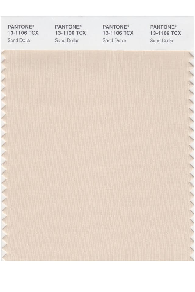
2006: Sand Dollar
Natural and organic, Sand Dollar – considered to express concerns about the 2006 economy – is a warm shade that relaxes and soothes nerves. It is also reminiscent of the desert and soft sandy beaches.

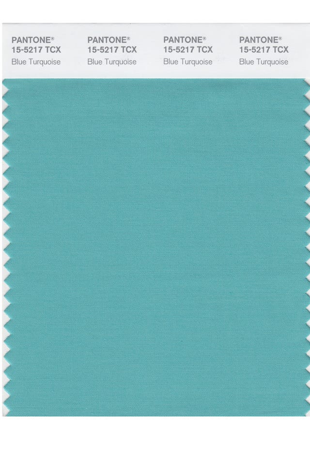
2005: Blue Turquoise
Taking inspiration from the colour of the sea, the calming and reassuring Blue Turquoise is gentler in tone than true Turquoise.

2004: Tigerlily
Bright, bold, passionate and rejuvenating, Tigerlily contains red and yellow and draws its inspiration from the flowers around us.

2003: Aqua Sky
Soft, calm and cool, the blue-green Aqua Sky lends a serene look.

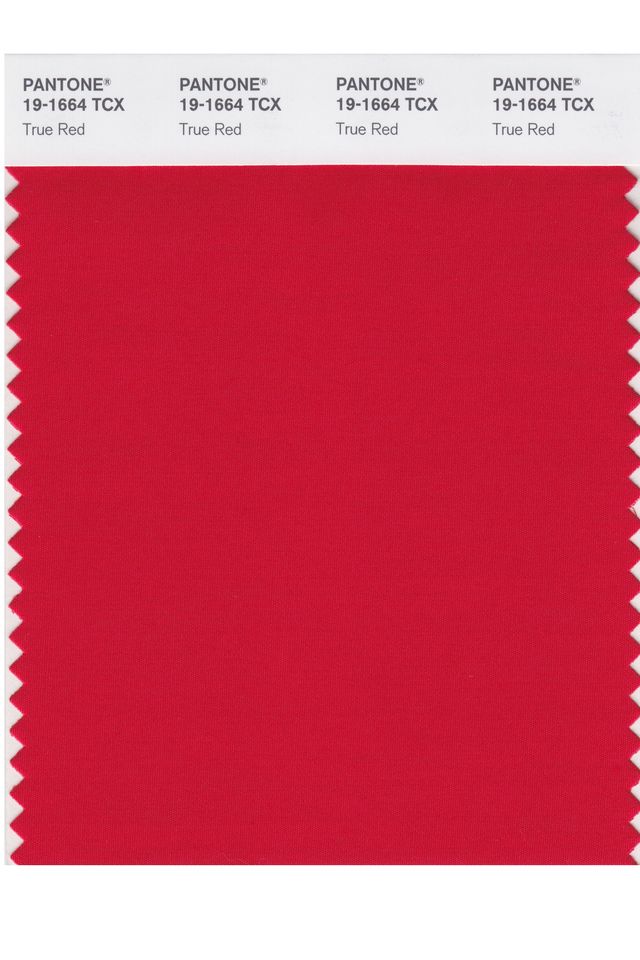
2002: True Red
A vivid red, associated with love, passion and power, and chosen for its deep and meaningful hue.

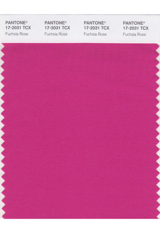
2001: Fuchsia Rose
A bright, feel-good feminine colour, Fuchsia Rose is passionate, intense and exciting, yet also warm and endearing.

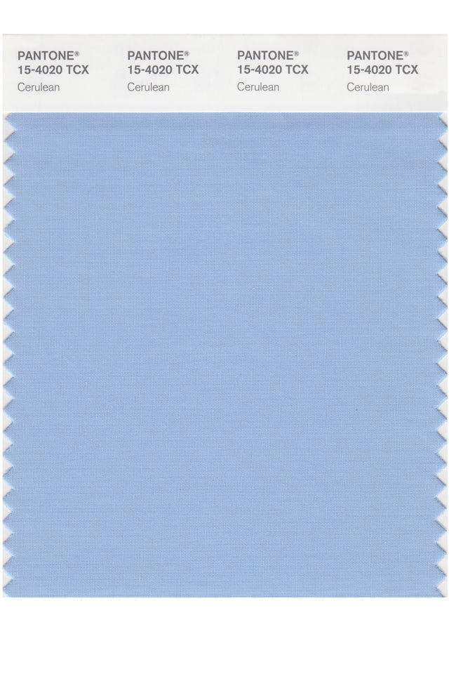
2000: Cerulean
The official colour of the millennium is Cerulean Blue; the colour of the sky on a serene, crystal clear day. It connotes restful, peaceful and relaxing times.


